24 February 2025
Mastering the Art of Attention
Mastering the Art of Attention
Author: Razeena
Mastering the Art of Attention
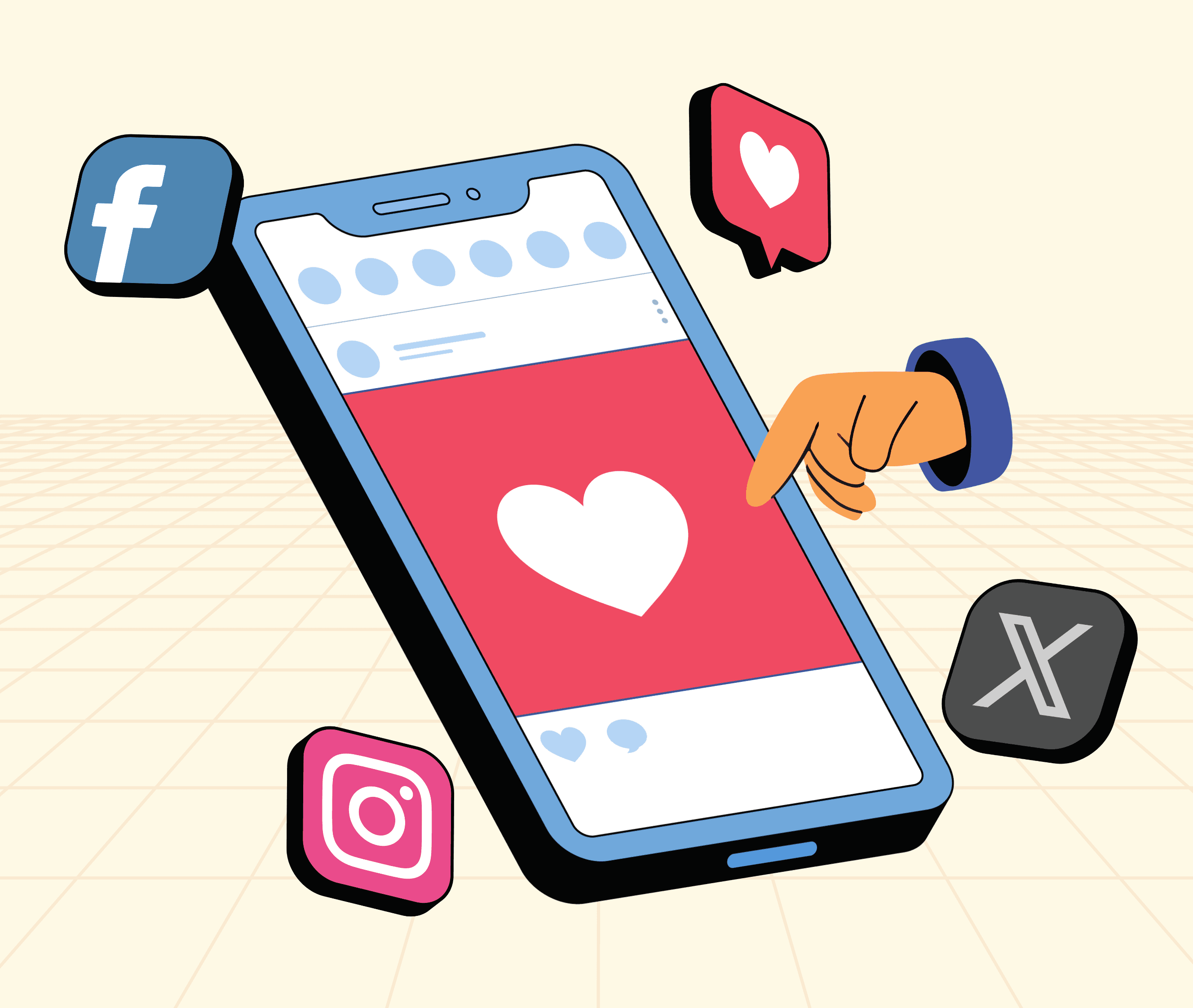
In a digital world where scrolling never stops, grabbing attention is a challenge. Studies show you have just 2 seconds to make an impression before your audience moves on. If your content isn't clear, engaging, and visually optimized, it gets lost in the noise.
So, how do you create content that stops the scroll and holds attention? Let's dive into the key principles.
1️⃣ The 2-Second Rule: Why It Matters
Before we talk about solutions, let’s understand why attention spans are shrinking:
Social media feeds prioritize fast, engaging content—if it’s not instantly appealing, it's skipped.
The human brain processes visuals 60,000x faster than text, making design critical.
The rise of short-form video (Reels, TikToks, YouTube Shorts) has conditioned audiences to expect quick, digestible content.
If your audience doesn’t immediately see value, relevance, or intrigue, they will scroll past your content.
How to Apply the 2-Second Rule
1. Start with a strong hook (question, statement, or problem).
2. Make your message instantly clear—avoid fluff.
3. Use visuals that support your message, not distract from it.
Example:
- "Our brand helps businesses grow through expert marketing strategies."
- "Struggling to get leads? Let’s fix that—here’s how!"
2️⃣ Keep It Snackable: The Power of Microcontent
People don’t read—they skim. If your content is too long or cluttered, it gets ignored.
How to Make Content Snackable
Use short sentences. Avoid dense paragraphs.
Bullet points and bold text help structure information.
Break text into sections with clear subheadings.
Use numbers and lists (e.g., "5 Ways to Boost Engagement").
Example:
"To create engaging social media content, ensure your captions are concise, use high-quality visuals, and add a call-to-action."
"Want better engagement? Keep captions short, use great visuals, and always add a CTA."
3️⃣ Design for Speed: Make It Easy to Skim
Aesthetics matter. If your content looks cluttered or unstructured, people won't even try to read it.
How to Optimize for Fast Consumption
Use large, readable fonts—avoid small or decorative fonts.
Prioritize contrast (dark text on light backgrounds or vice versa).
Keep layouts clean—avoid too many elements.
Use white space to guide focus and reduce visual fatigue.
Tip: The "F-pattern" and "Z-pattern" layouts guide the reader’s eye naturally—align your key messages accordingly.
4️⃣ Guide the Eye: The Science of Visual Hierarchy
Ever wondered why some content just feels easier to digest? It’s all about visual hierarchy—the way we naturally read and process information.
How to Structure Content Visually
Biggest text = Most important message.
Bold, colors, and icons help emphasize key points.
Directional cues (arrows, underlines, eye-tracking patterns) tell the user where to focus.
Example: Headlines should be larger & bolder than body text, and CTA buttons should stand out with contrast.
5️⃣ Micro-Interactions: The Secret to Higher Engagement
Static content is forgettable. Motion adds life.
How Small Interactions Make a Big Difference
Swipeable carousels = More engagement, less overwhelm.
Hover effects and animations = Make content interactive.
Dynamic text reveals = Keep users engaged longer.
💡 Tip: Instagram Reels and TikTok prove that motion grabs attention—apply the same logic to your designs.
Attention is Currency—Spend It Wisely
In today’s fast-paced digital world, attention is the most valuable asset—and you only get 2 seconds to earn it. By crafting snackable, visually optimized, and engaging content, you increase the chances of stopping the scroll and making an impact.
To recap:
✅ Hook fast—your first words matter.
✅ Keep it short & structured—clarity wins.
✅ Design for speed—make it effortless to consume.
✅ Use motion & interactivity—keep engagement high.
The brands winning today aren’t just creating content—they’re creating experiences that demand to be noticed. Now it’s your turn!
Mastering the Art of Attention
In a digital world where scrolling never stops, grabbing attention is a challenge. Studies show you have just 2 seconds to make an impression before your audience moves on. If your content isn't clear, engaging, and visually optimized, it gets lost in the noise.
So, how do you create content that stops the scroll and holds attention? Let's dive into the key principles.
1️⃣ The 2-Second Rule: Why It Matters
Before we talk about solutions, let’s understand why attention spans are shrinking:
Social media feeds prioritize fast, engaging content—if it’s not instantly appealing, it's skipped.
The human brain processes visuals 60,000x faster than text, making design critical.
The rise of short-form video (Reels, TikToks, YouTube Shorts) has conditioned audiences to expect quick, digestible content.
If your audience doesn’t immediately see value, relevance, or intrigue, they will scroll past your content.
How to Apply the 2-Second Rule
1. Start with a strong hook (question, statement, or problem).
2. Make your message instantly clear—avoid fluff.
3. Use visuals that support your message, not distract from it.
Example:
- "Our brand helps businesses grow through expert marketing strategies."
- "Struggling to get leads? Let’s fix that—here’s how!"
2️⃣ Keep It Snackable: The Power of Microcontent
People don’t read—they skim. If your content is too long or cluttered, it gets ignored.
How to Make Content Snackable
Use short sentences. Avoid dense paragraphs.
Bullet points and bold text help structure information.
Break text into sections with clear subheadings.
Use numbers and lists (e.g., "5 Ways to Boost Engagement").
Example:
"To create engaging social media content, ensure your captions are concise, use high-quality visuals, and add a call-to-action."
"Want better engagement? Keep captions short, use great visuals, and always add a CTA."
3️⃣ Design for Speed: Make It Easy to Skim
Aesthetics matter. If your content looks cluttered or unstructured, people won't even try to read it.
How to Optimize for Fast Consumption
Use large, readable fonts—avoid small or decorative fonts.
Prioritize contrast (dark text on light backgrounds or vice versa).
Keep layouts clean—avoid too many elements.
Use white space to guide focus and reduce visual fatigue.
Tip: The "F-pattern" and "Z-pattern" layouts guide the reader’s eye naturally—align your key messages accordingly.
4️⃣ Guide the Eye: The Science of Visual Hierarchy
Ever wondered why some content just feels easier to digest? It’s all about visual hierarchy—the way we naturally read and process information.
How to Structure Content Visually
Biggest text = Most important message.
Bold, colors, and icons help emphasize key points.
Directional cues (arrows, underlines, eye-tracking patterns) tell the user where to focus.
Example: Headlines should be larger & bolder than body text, and CTA buttons should stand out with contrast.
5️⃣ Micro-Interactions: The Secret to Higher Engagement
Static content is forgettable. Motion adds life.
How Small Interactions Make a Big Difference
Swipeable carousels = More engagement, less overwhelm.
Hover effects and animations = Make content interactive.
Dynamic text reveals = Keep users engaged longer.
💡 Tip: Instagram Reels and TikTok prove that motion grabs attention—apply the same logic to your designs.
Attention is Currency—Spend It Wisely
In today’s fast-paced digital world, attention is the most valuable asset—and you only get 2 seconds to earn it. By crafting snackable, visually optimized, and engaging content, you increase the chances of stopping the scroll and making an impact.
To recap:
✅ Hook fast—your first words matter.
✅ Keep it short & structured—clarity wins.
✅ Design for speed—make it effortless to consume.
✅ Use motion & interactivity—keep engagement high.
The brands winning today aren’t just creating content—they’re creating experiences that demand to be noticed. Now it’s your turn!

Get Notifications For Each Fresh Post
Not Spam, just certified good stuff
Get Notifications
For Each Fresh Post
Not Spam, just certified good stuff